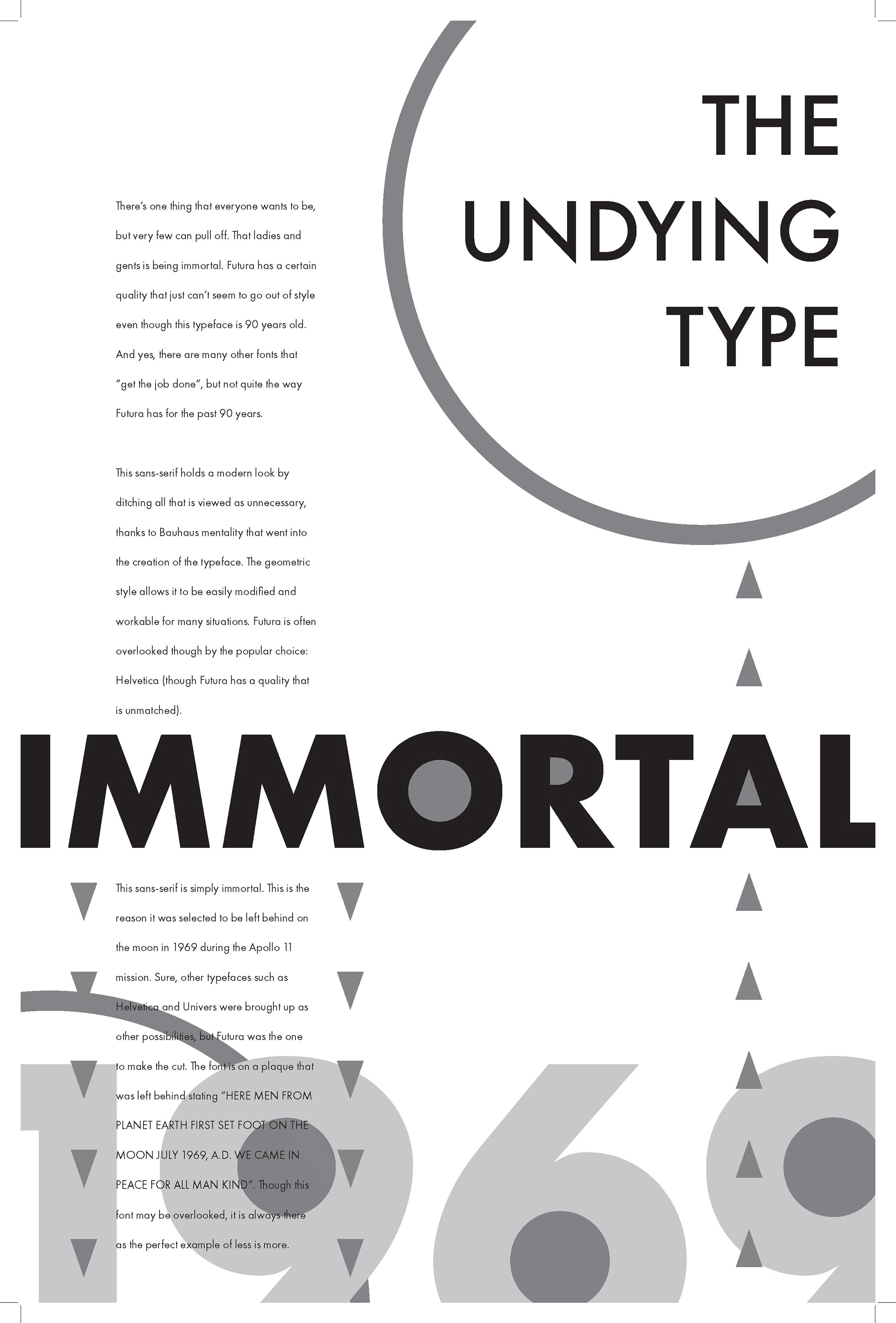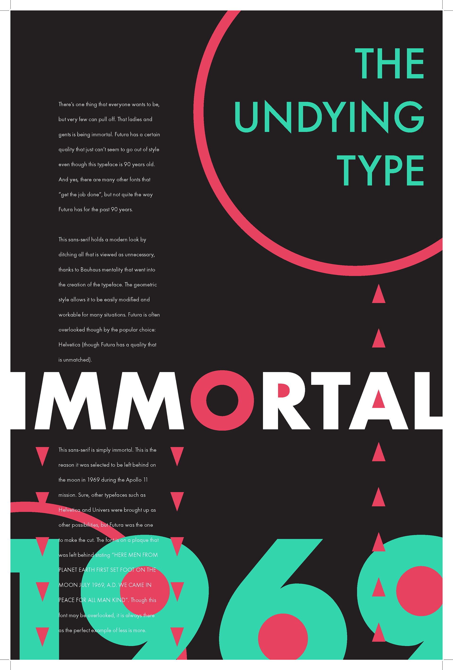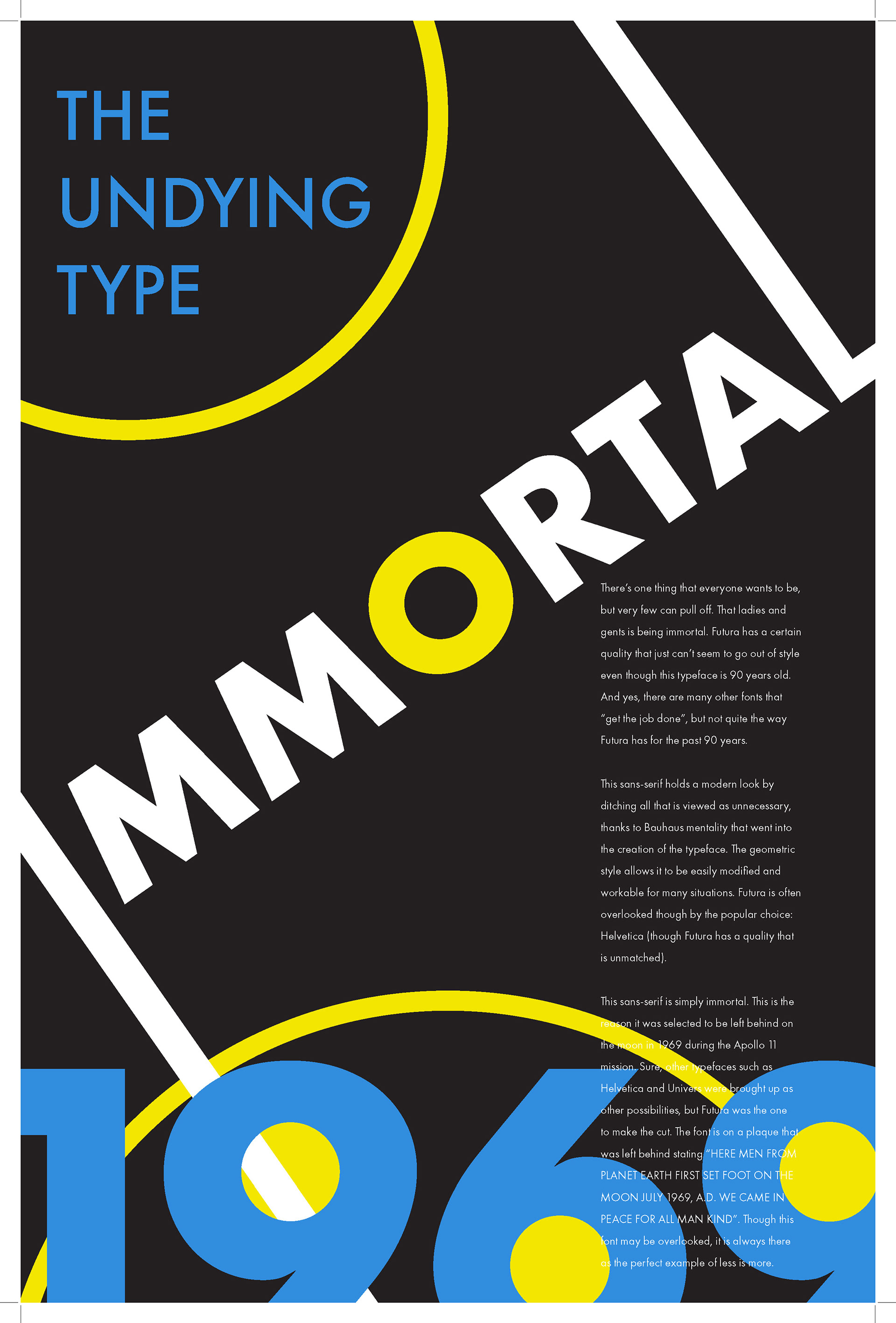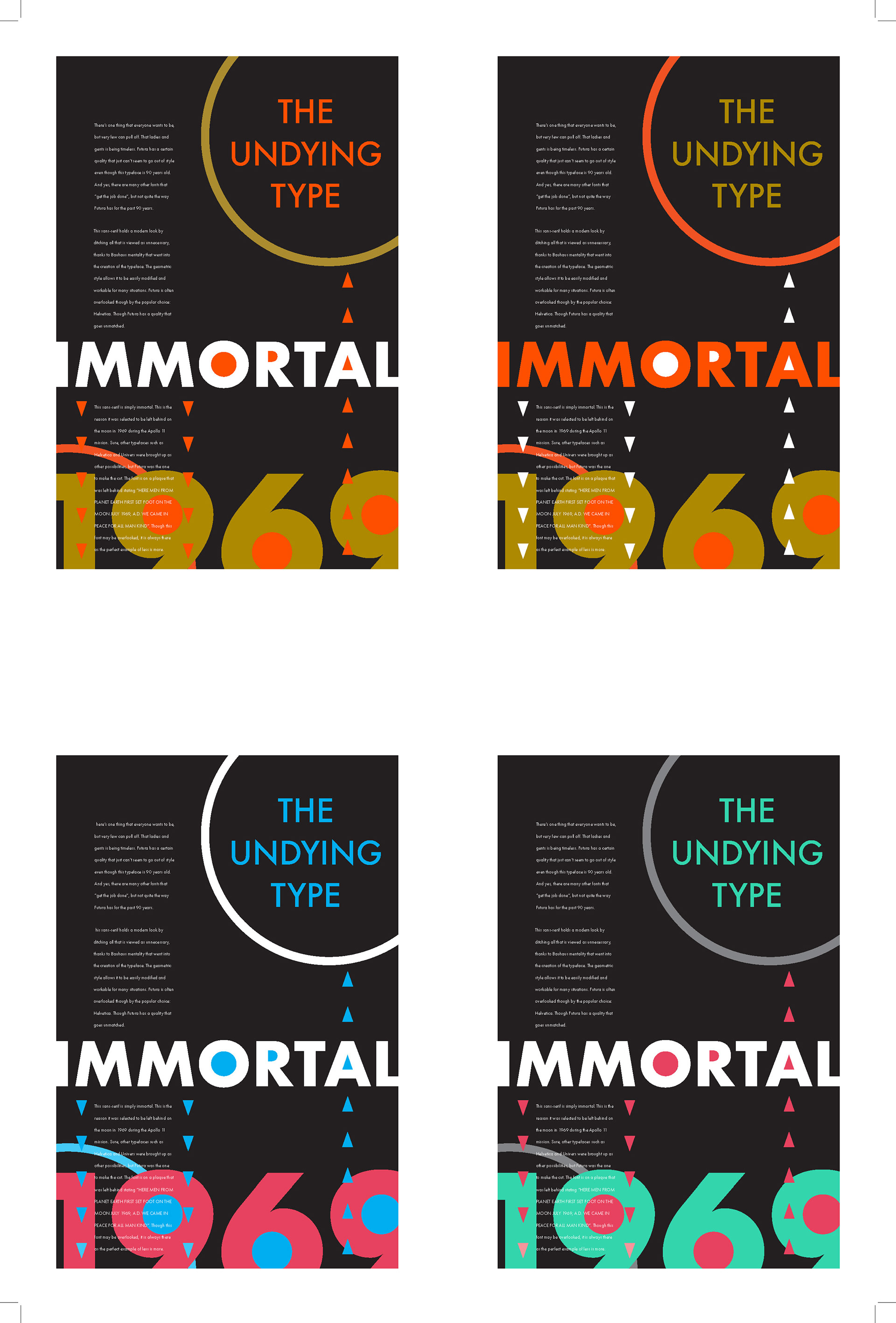
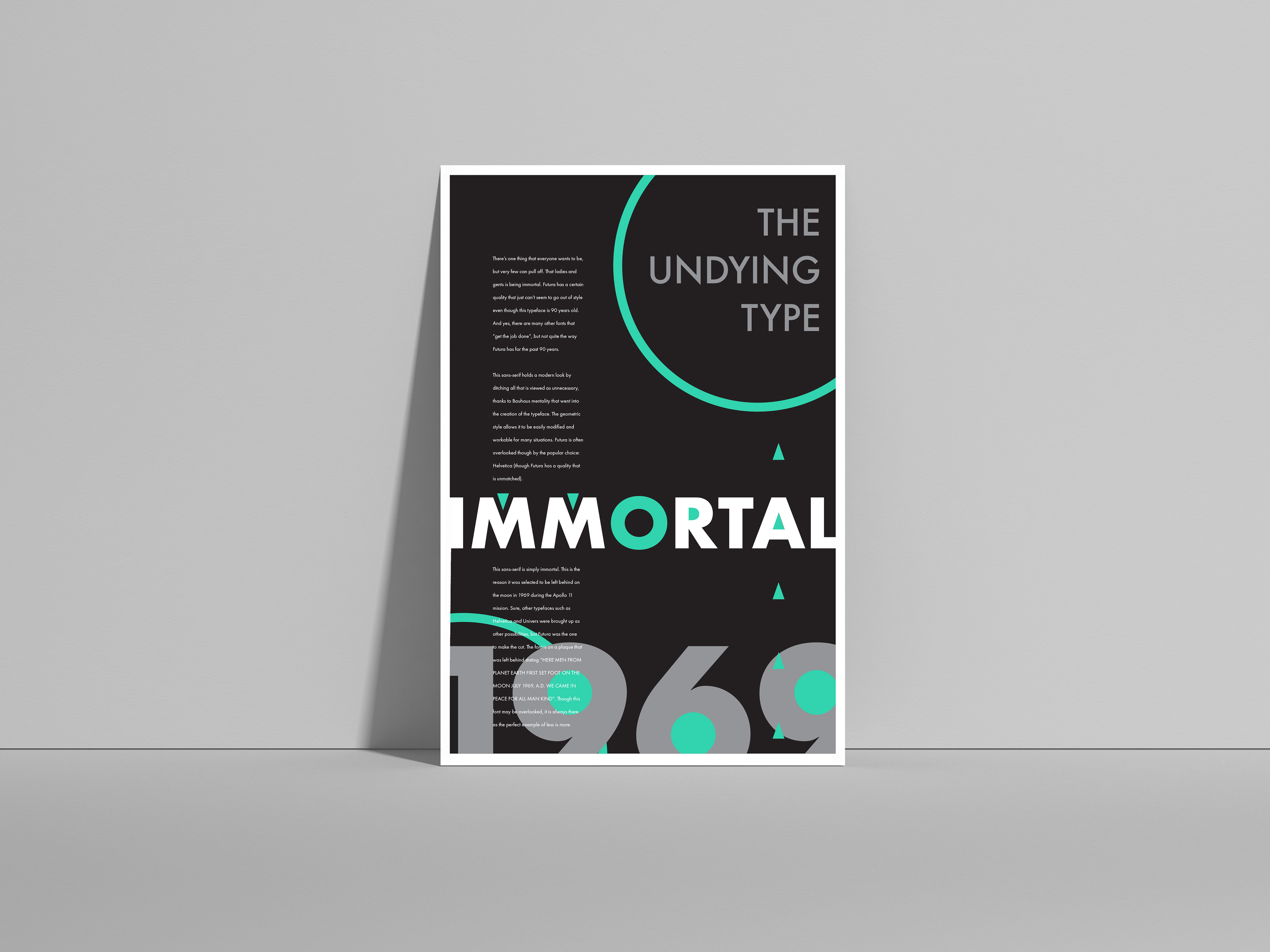
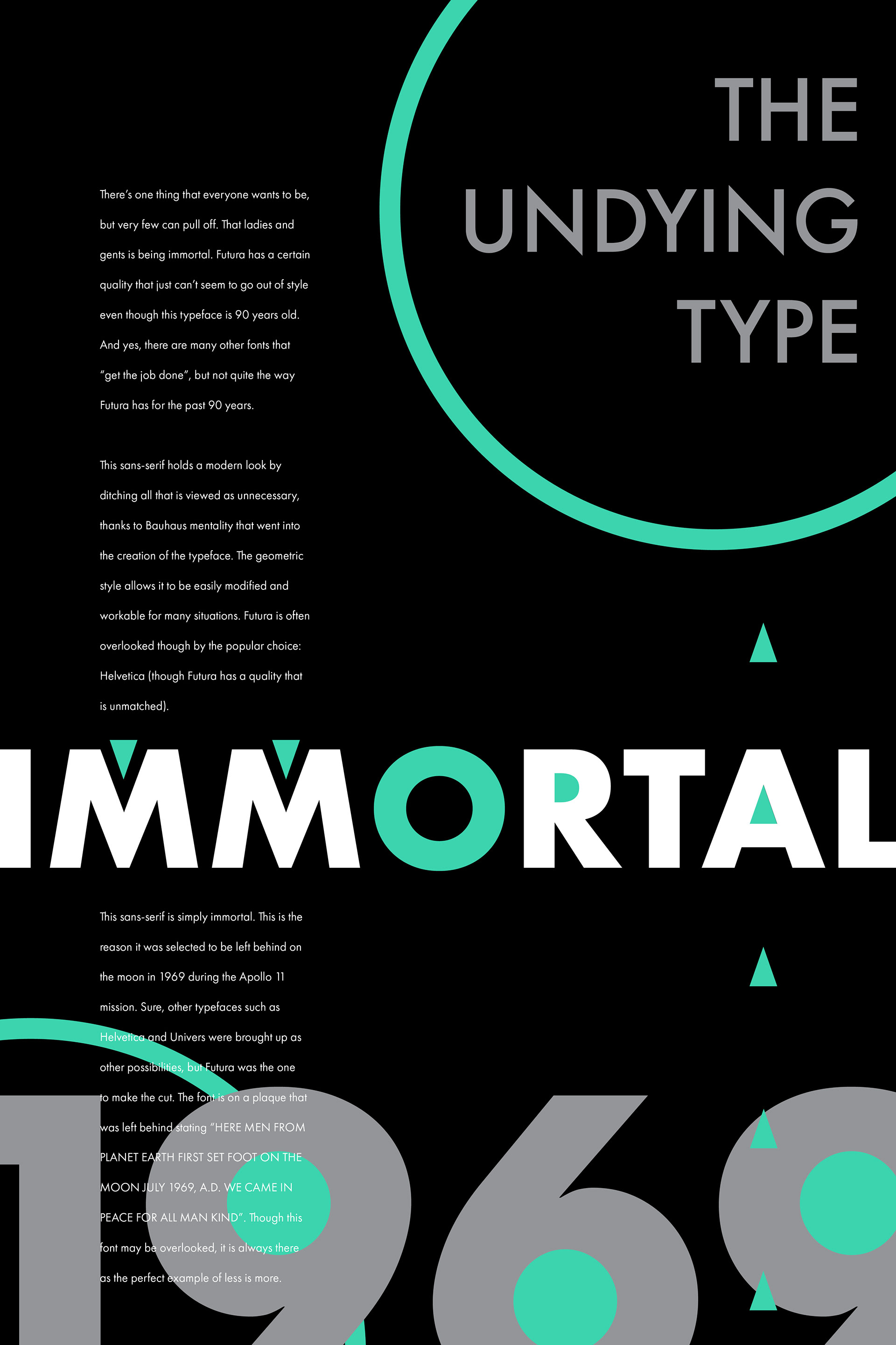
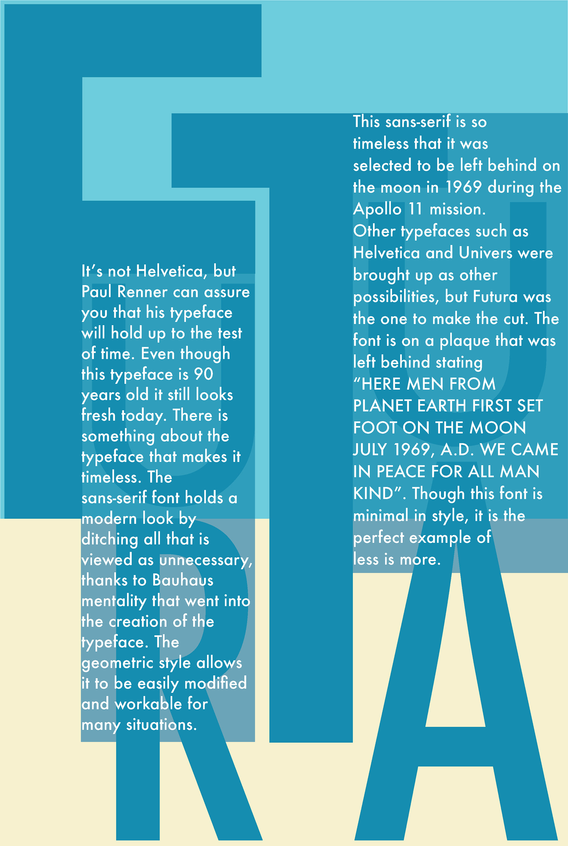
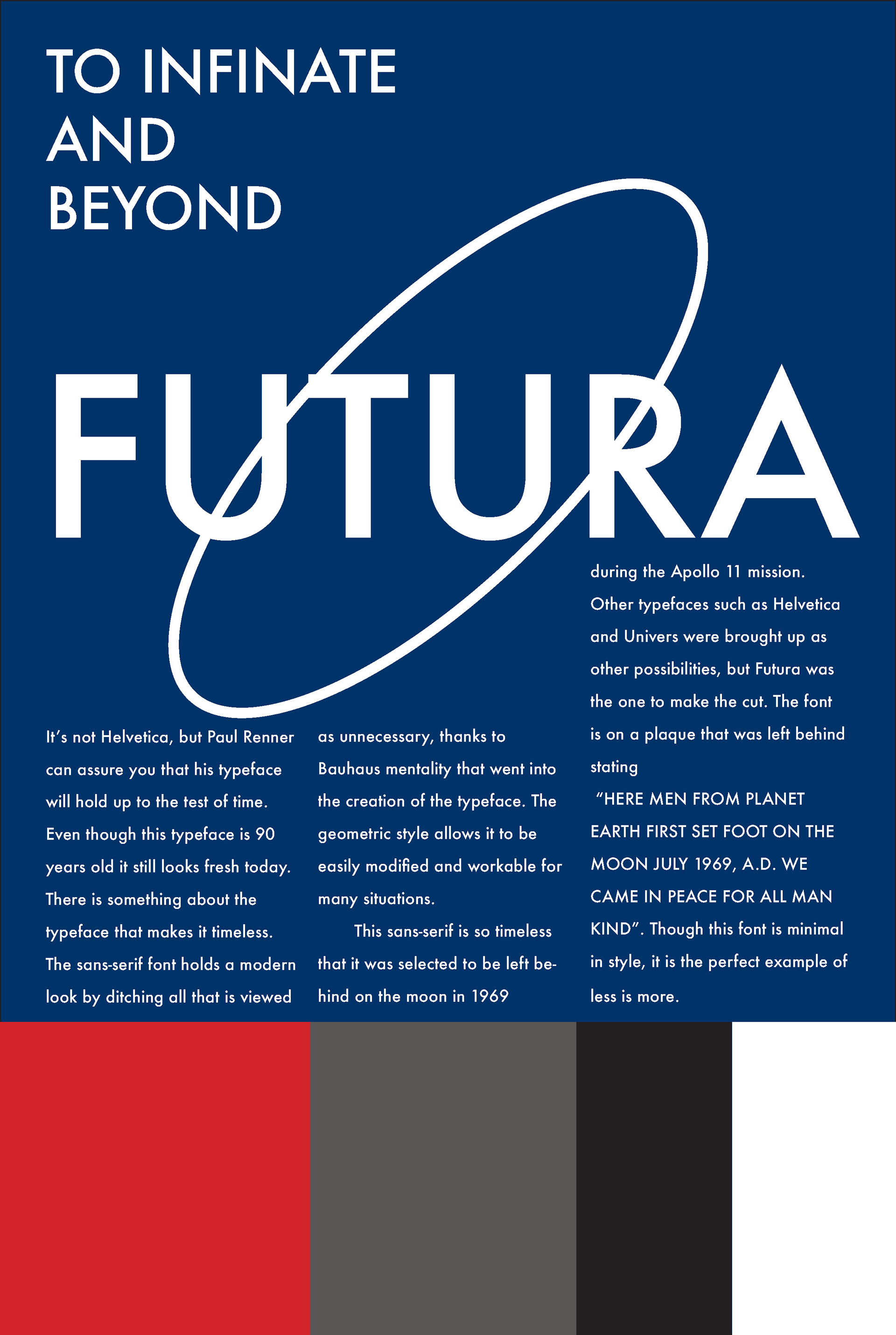
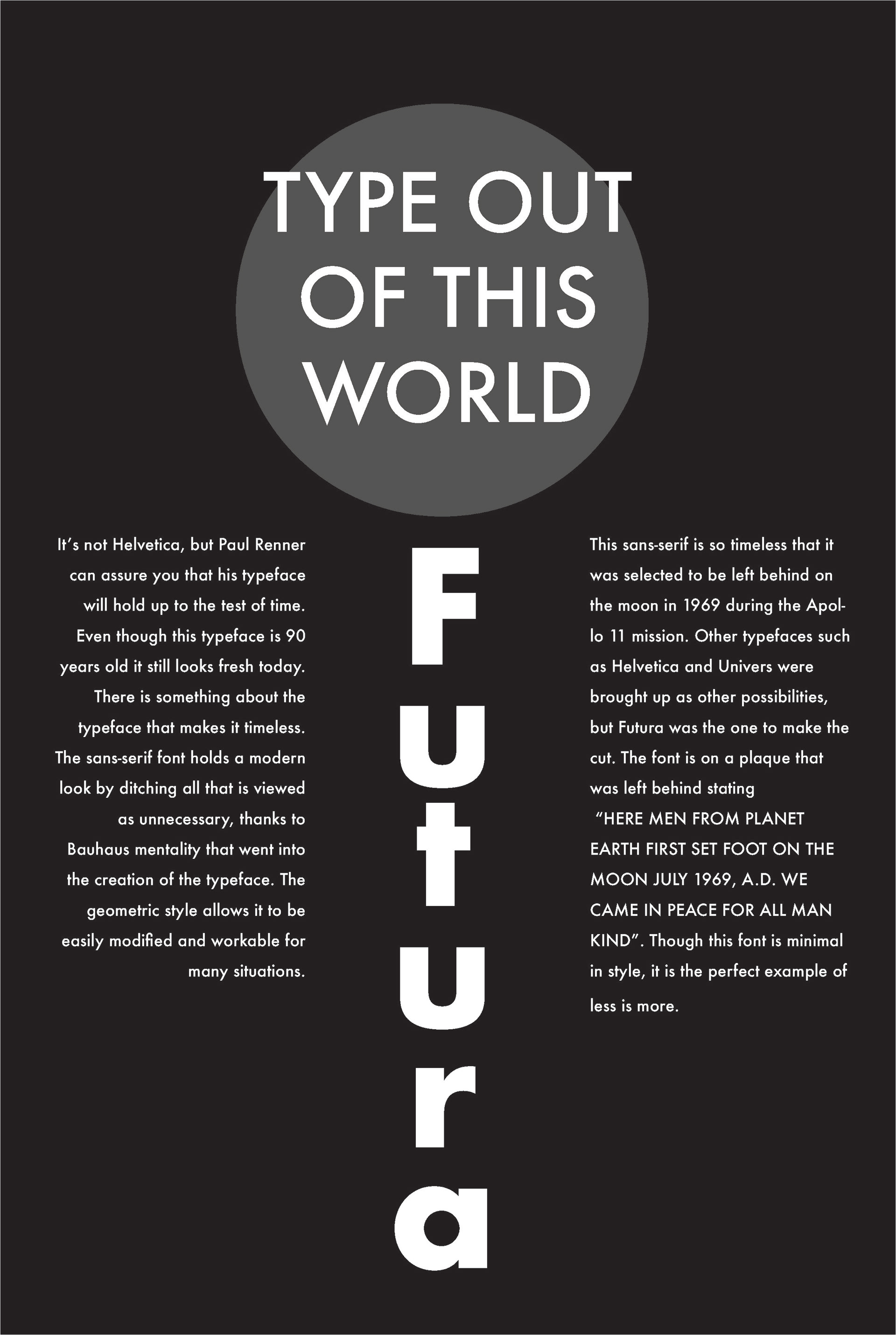
The poster and the story point out the timeless quality of Futura and its' geometric features that keep it looking modern. 1969 is a call out to the date it was placed on the moon. The holes in the letterforms are brought out with the contrast of color and the repeated triangle of the A. The colors are chosen to resemble a space/future theme.
Typefaces:
Project: Futura - Bold, Medium, Book
Project: Futura - Bold, Medium, Book
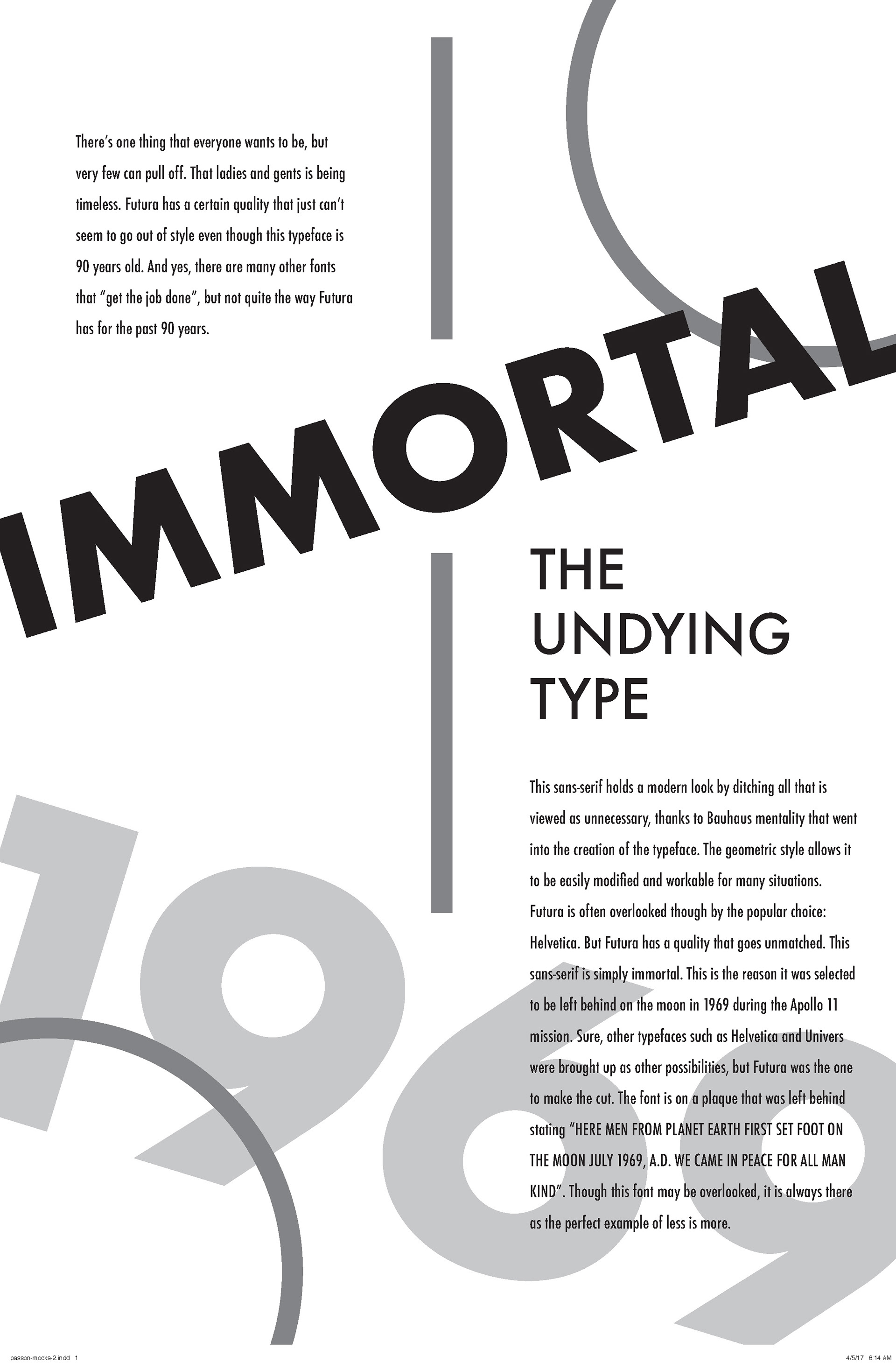
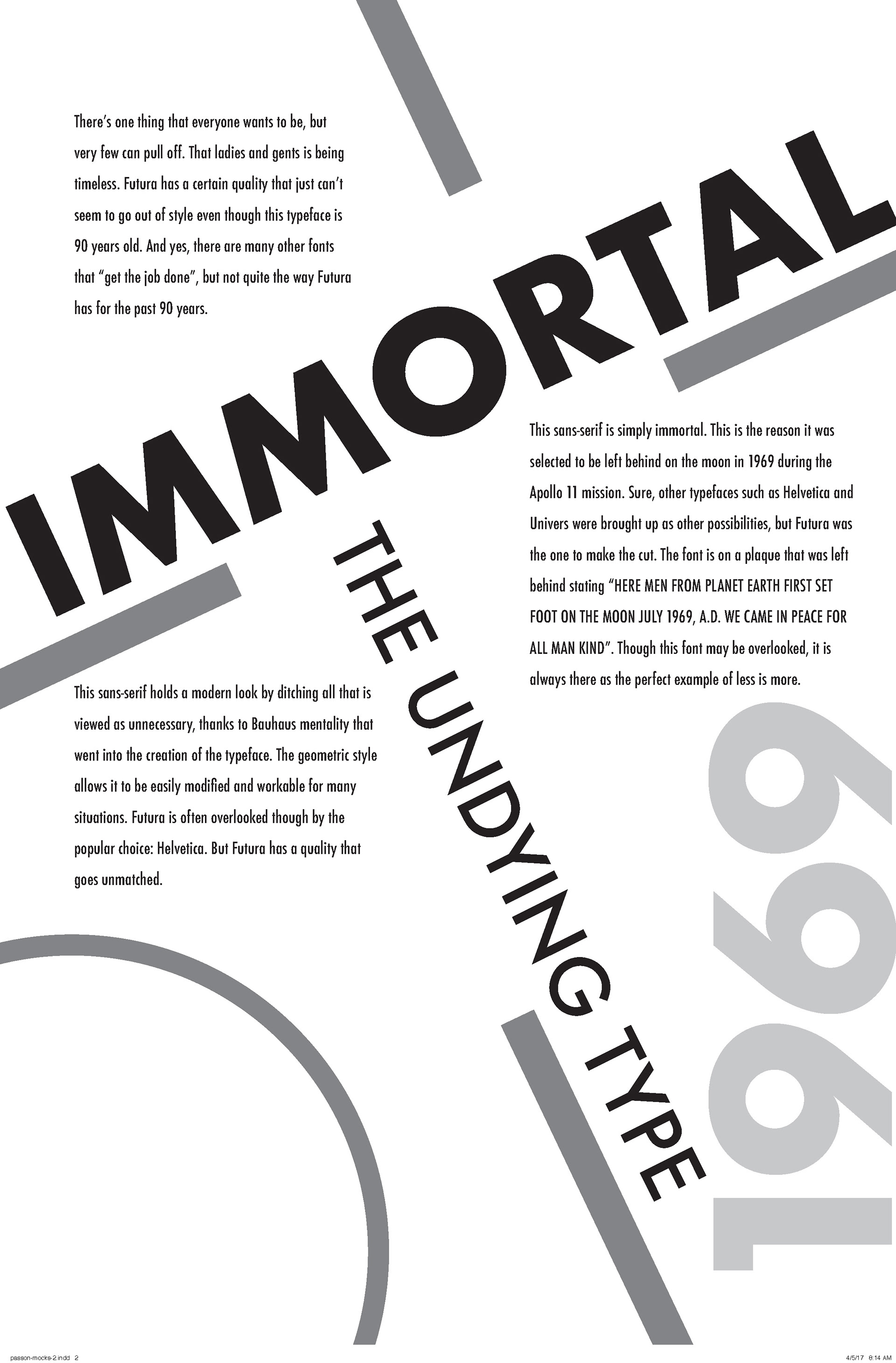
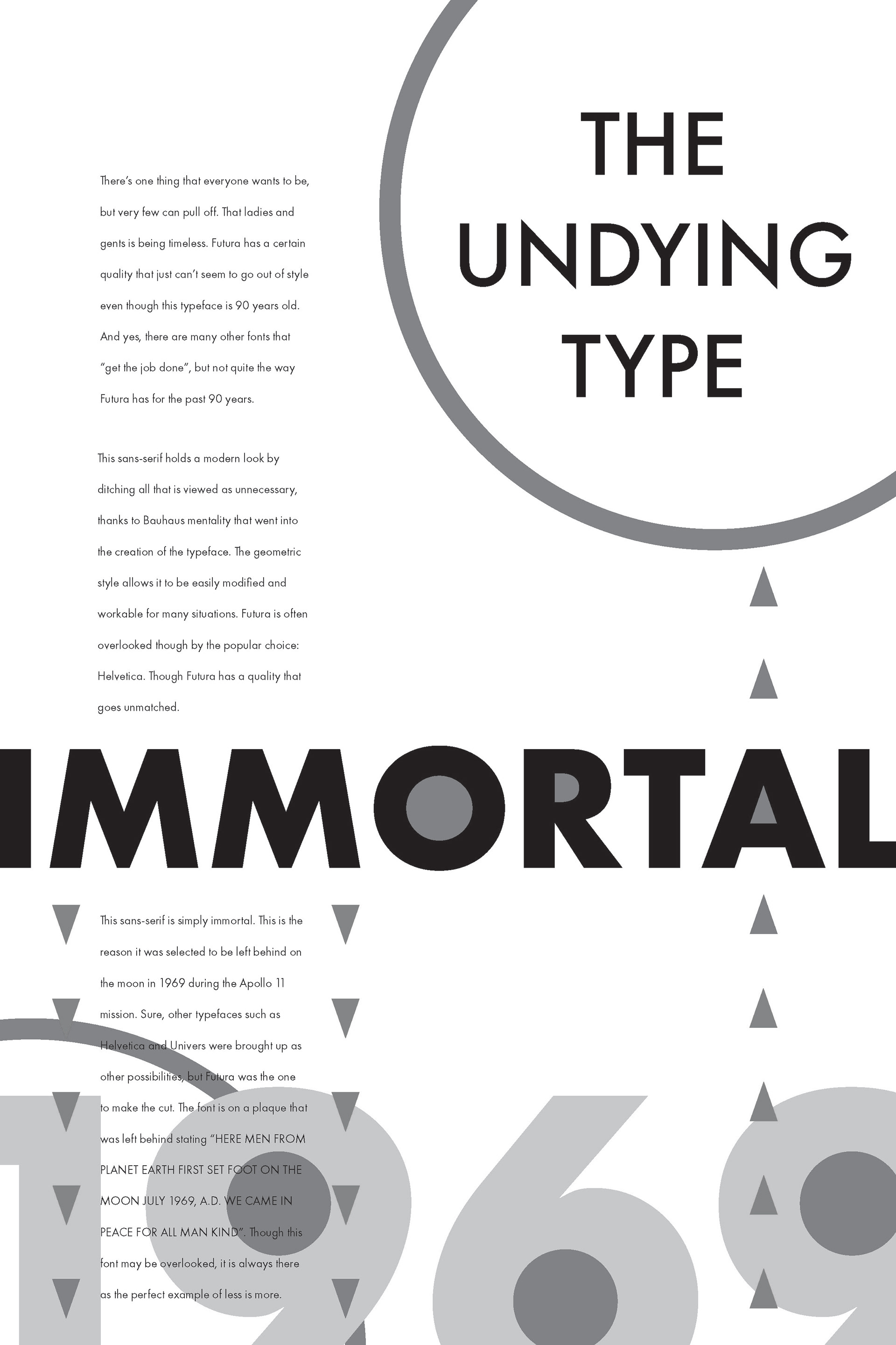
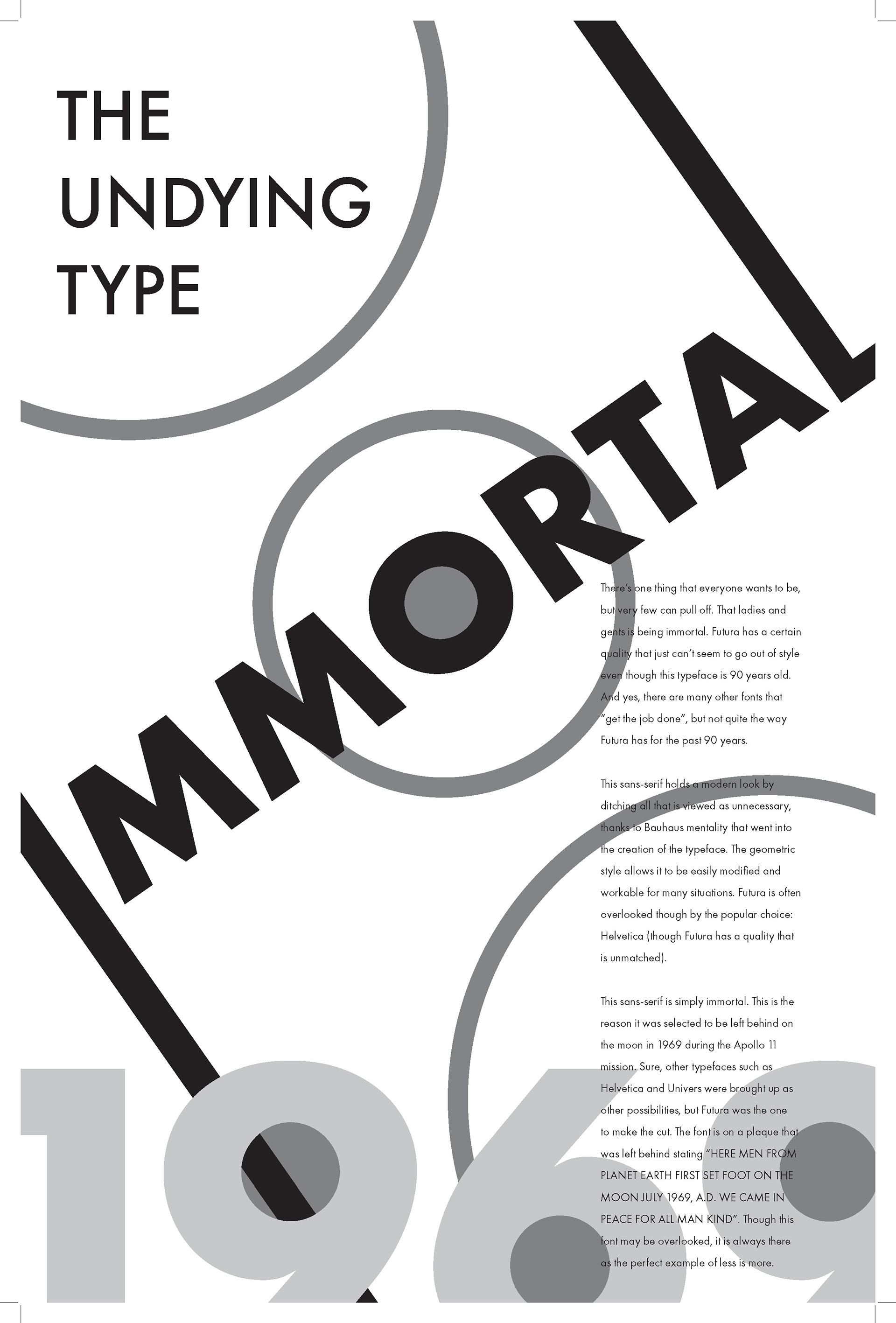
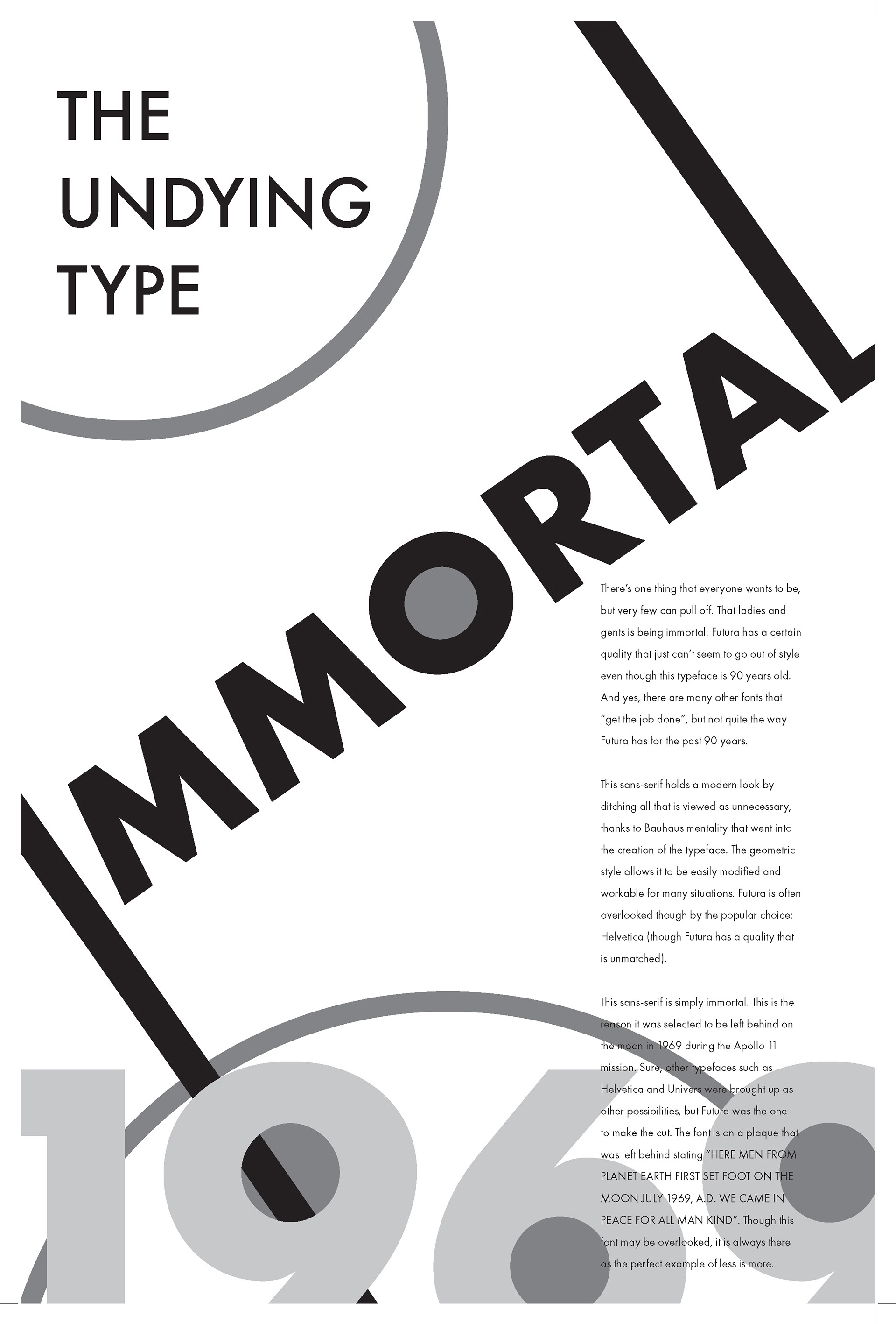
Process work. These first 4 were the first digital roughs.
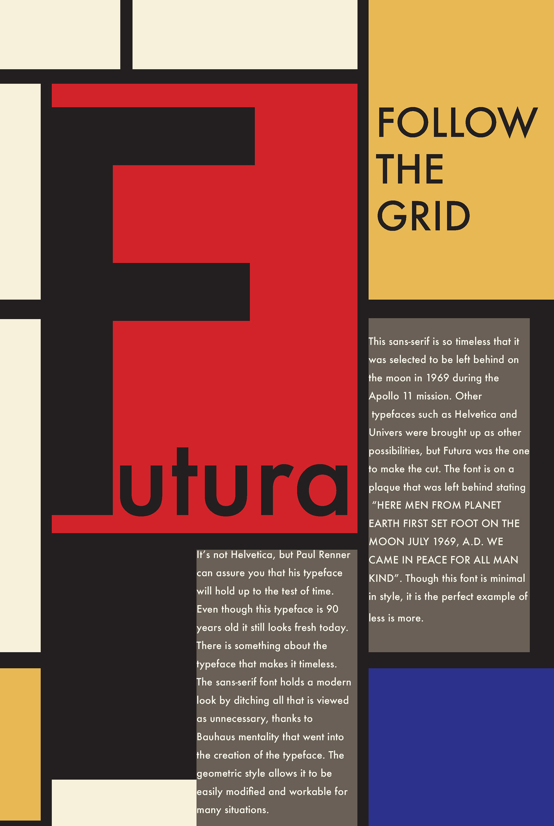
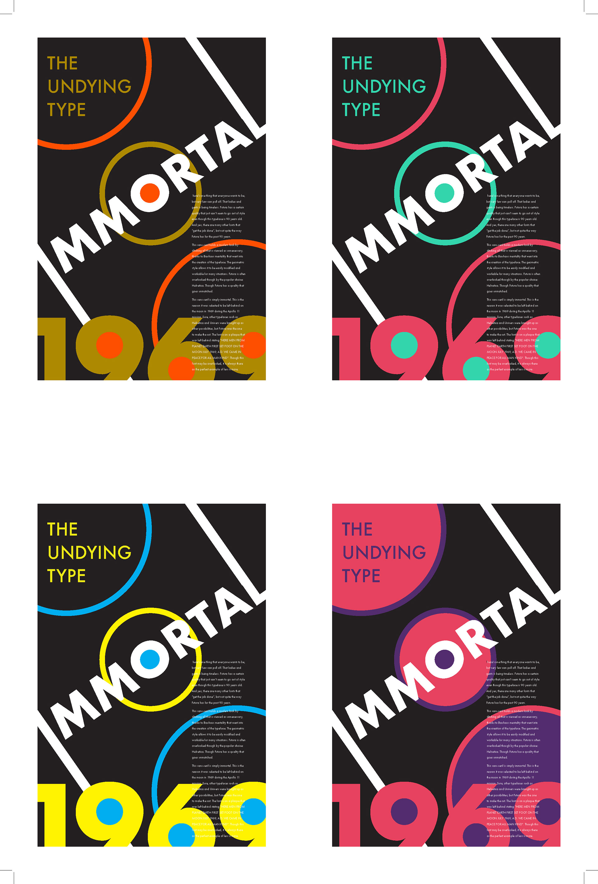
After doing rough sketches, creating various grids, and many critiques it was clear there were more dynamic solutions to this problem. Once the initial feel of the design was established it was deciding on a color theme that fits with the typeface and the story.